
Google’s mobile-first indexing: will it affect desktop SEO rankings?
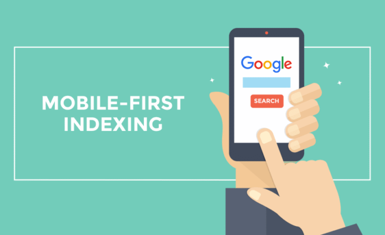
Google surprised us with one of its algorithm changes: mobile-first indexing. Given that the majority of web traffic globally comes from mobile devices, it’s not surprising that the major search engine wants to prioritize them. But do you know what that means for your website’s rankings? Read on to find out!
Indexing and ranking on Google
To understand how this change works, the first thing we have to look at is how indexing (crawling pages) and ranking (positioning) work in Google.
Indexing is a process that consists of Google’s crawlers or “spiders” locating a web page, reading its content, and storing this information in an index. This index is like a giant library where all the web pages that Google has been able to find are stored.
Ranking is the process by which the search engine evaluates all the information in its index and decides which pages best correspond to a user’s search. In other words, the ranking is like the librarian who recommends the books that best suit your needs. But as with a real library, you can only choose from the catalog of books that exist in the library. In other words, a page cannot rank among the search results if it has not been previously stored in the index.
How does mobile-first indexing affect ranking?
Mobile-first indexing affects indexing, i.e., how a website is stored in the index and not its final positioning. But in some circumstances, it can have negative repercussions for desktop web rankings.
If the mobile version and the desktop version of a website have the same content, then mobile-first indexing will not affect us, and everything will remain the same as before. The problem comes with sites that have created a shorter version for mobile.
In those cases, Google will keep only the information that is on the mobile website, so the “expanded” content of the desktop version will not appear in its indexes. If you were indexing the full version before, this means that your positioning will surely drop, since it now offers less information and is therefore less relevant when answering searches.
Therefore, the solution to adapt smoothlmobile-firstingtxing is to have the same information on all versions of a page. So instead of creating separate sites for mobile users, my recommendation is to consider switching to responsive design. In this way, you will have a single website that will adapt perfectly to all types of devices. And in addition to ranking better on Google, you’ll have to spend less time on maintenance.


